New height units in CSS
New height units in CSS
There are new height units in CSS that are very awesome.
Salesman voice: "Are you tired of your UI getting cut off even when you set it too 100vh? Is your address bar taking up the space that could have been used by UI? Then you are in the right place. Here are the new height units that you can use to solve your UI problems."
But really, these new viewport heights are so awesome. Not for desktop browsers but for mobile ones anyway.
-
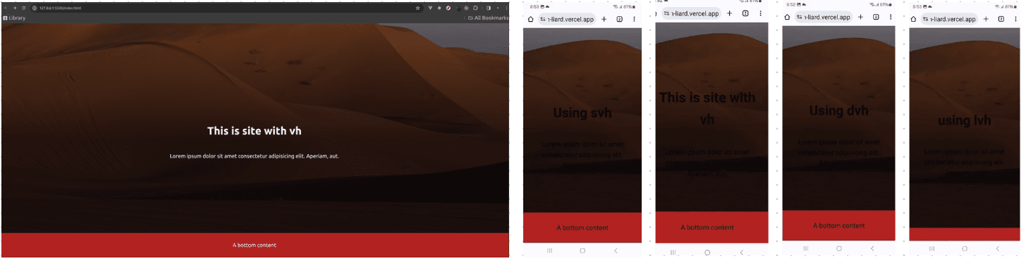
Dynamic viewport height(dvh): This is super useful for mobile web-apps. It will take that
100vhheight it is supposed to and you don't have to scroll to see the content that is meant to seen at first glance. One disadvantage of dvh is the content of UI jumps when you scroll. This jumping is because setting100dvhrecalculates the height on every scroll to give that full height view. -
Small viewport height(svh): Similar to
dvh, it takes100vhheight and good thing is that it doesn't jump when you scroll. -
Large viewport height(lvh): This is very similar to viewport height. It takes
100vhheight and good thing is that it doesn't jump when you scroll. But there will always be some extra content that will be visible, more than just the content you want.
These new viewport heights are really good when working with responsive designs and supported in most of the newest browsers.
body {
  min-height: 100vh;
  min-height: 100svh;
}
Setting it like above, one can be free of responsiveness-hassle. Desktop browser will take 100vh and mobile browser will take 100svh.